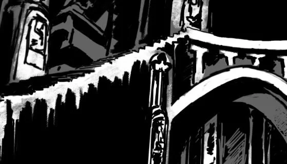
When working on The Long and Dark, I wanted to create something different for the layout of the book’s interior. While the Realm of Tah’afajien series has always had a set layout design, I’ve had allowances to experiment with the presentation of my stand-alone works.
What I settled on this time around? Chapter ornamentation.
As a fan of Chattanooga native Barry Moser, I've always been drawn to the illustrated versions of books and the idea of doing interior chapter artwork, also known as ornamentation. Between his work on the Books of Wonder version of Bram Stoker's Dracula, Lewis Carroll's Alice's Adventures in Wonderland, Baum's The Wonderful Wizard of Oz, and Melville's Moby-Dick or, The Whale, it was only a matter of time before I tried it out myself.
In college (alumni of UTC), I took a couple of Illustration courses, including an independent study in book illustrations, where I painted a series of for Lovecraft's At the Mountains of Madness.
About two years ago, I finally decided to read through the Harry Potter series and it renewed my interest in taking on the challenge of doing my own ornamentation. It wasn't until I was deep into the editing process of The Long and Dark that I made the time to sit down and pull the project together.
Note: Unlike a lot of my other works, this entire series is done digitally.
Chapter One
While there are certainly other elements that could have been presented, I wanted the focus of Chapter One’s artwork to be the story’s symbolic and introductory element: the opening on Pilsu-kimah which leads to Dineothan.
From the book:
It was there, at the top of the hill, that he spotted the entrance. For some reason, he’d expected to see some ancient structure, perhaps an abandoned mausoleum or derelict chapel. Maybe he’d let the stories go to his head.
Instead, it was a simple hole lined with pavers around the lip.
He walked to the edge and saw stairs descending steeply into the darkness below. Stone-laid walls propped up the surrounding soil. Though the steps were quickly swallowed up by the subterranean darkness, he managed to spot an ancient archway marking the entrance.
— Chapter One, The Long and Dark
In the gallery on the right:
Slide one is the rough concept done before I finalized the frame layout for the series. Only chapters one and eleven have concept drawings.
Slide two is the final piece
Slide three is how it’s laid out in the book.
Chapter Two
The artwork for chapter two sets the stage for one of the primary locations for the first third of the book. It’s intended to display a single moment in Gareth’s introduction to Upelstbohr’s strange architecture as seen through his eyes as he first wakens.
Fun fact: The chapter name (The Halls of Perpetual Arrival) is the only time the location is properly named.

From the book:
Once Gareth was upright, he noticed that the interior did not entirely follow the standard design of any cathedral he’d seen before. While not a devout man himself, both Gareth’s and Nattia’s families had been staunch parishioners; he’d seen his fair share of worship houses over the years. While the narthex and nave hinted at familiarity, everything to his left served a different purpose. Beyond the transept, where a traditional choir and apse should have been, was an atrium that served as the ground level of a massive tower. It rose what seemed like dozens of yards above him.
— Chapter Two, The Long and Dark
Be sure to check out the Gallery for additional artwork.


