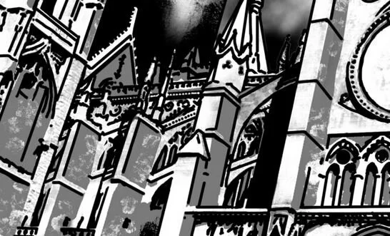
Unlike previous stories, the artwork for The Long and Dark focuses a lot more on scenery, architecture and physical objects found in the world. This makes sense considering the book’s focus on the city’s appearance and the mood of loneliness and horror it’s intended to facilitate.
Note: This is a continuation of part one, which features artwork for Chapters One and Two.
Chapter Three
The below image (on the left) is one of a handful of pieces that went through a change just before the book was laid out. These kind of last-minute changes were possible due to the means in which the artwork was created: drawn digitally using a Wacom tablet and Photoshop.
Initially, the doors were illustrated as solid slabs (see image on the right), not unlike a stone mausoleum. The final piece, though, is redrawn more in line with wooden doors intended for an arched doorway.


From the book:
An image of the building had already formed in the back of his head, even from Alharrad’s strange blathering. Much like the sanctuary, the Lord’s Chapel had outsized proportions. Grand arched doors on the western face were ajar. Thin window-frames, many of which no longer contained glass panes, lined the upper floors. Twin coal-colored steeples rose to the sky above the main structure. The courtyard was bordered on all sides by tiers of the surrounding ward.
— Chapter Three, The Long and Dark
Chapter Four

The subject of Chapter Four’s artwork was relatively easy to lock down. While the location presents itself in chapter two and is first described in Chapter Three, Gareth makes his final return to the Halls in Chapter Four. Inspiration for the architecture came from various cathedrals, including Cathédrale Notre-Dame de Reims and Chartres Cathedral.
From the book:
Just as he cleared the last step, Gareth looked over his shoulder to the building he’d left behind. The stone-laid edifice rose above him, sullen and gray. A series of overly-ornate columns framed the entryway. Now paved over, rows of steep archways lined the exterior. What had once been a rose window was now a featureless circle of brick and mortar. Two sets of steeply-sloped buttresses flanked either side of the main building. Only separated by a wrought iron fence, adjacent edifices were crammed tightly against the cathedral’s property.
From where Gareth lingered, he spotted the cylindrical structure which loomed like a lighthouse over the sanctuary and surrounding wards. Atop it was a crown of thin, jagged, obsidian steeples. Even now, he was surprised at its towering height.
— Chapter Three, The Long and Dark
Chapter Five

While the chapter name (Naze) introduces one of the story’s limited cast, the artwork is focused on the source of the story’s current conflict - Gareth’s need to acquire the sigil key from the Lord’s Chapel. I intentionally avoided having the ornamentation reveal any of the characters in detail solely because I wanted the reader to form a mental image of the cast on their own.
From the book:
The sigil key was a construct of brass and bronze circles, layered into an interlocking pattern that held no immediate significance to Gareth. He held it close to his face and attempted to figure out how such an item would be employed. Just as he spotted something like a series of tiny gears in the tightly-pressed layers of metal hoops, Naze spoke up.
— Chapter Five, The Long and Dark
Be sure to check out the Gallery for additional artwork.


